Responsive Design and CSS Flexbox
Responsive design is a crucial aspect of modern web development, ensuring that websites adapt gracefully to various screen sizes and devices. By utilizing responsive design principles, developers can efficiently build user-friendly and accessible websites that cater to diverse audiences across a multitude of devices.
The following topics are covered in this tutorial:
-
Using CSS media queries and breakpoints to implement mobile-first responsive web design
-
Leveraging the various properties offered by CSS flexbox to build fluid and dynamic layouts
-
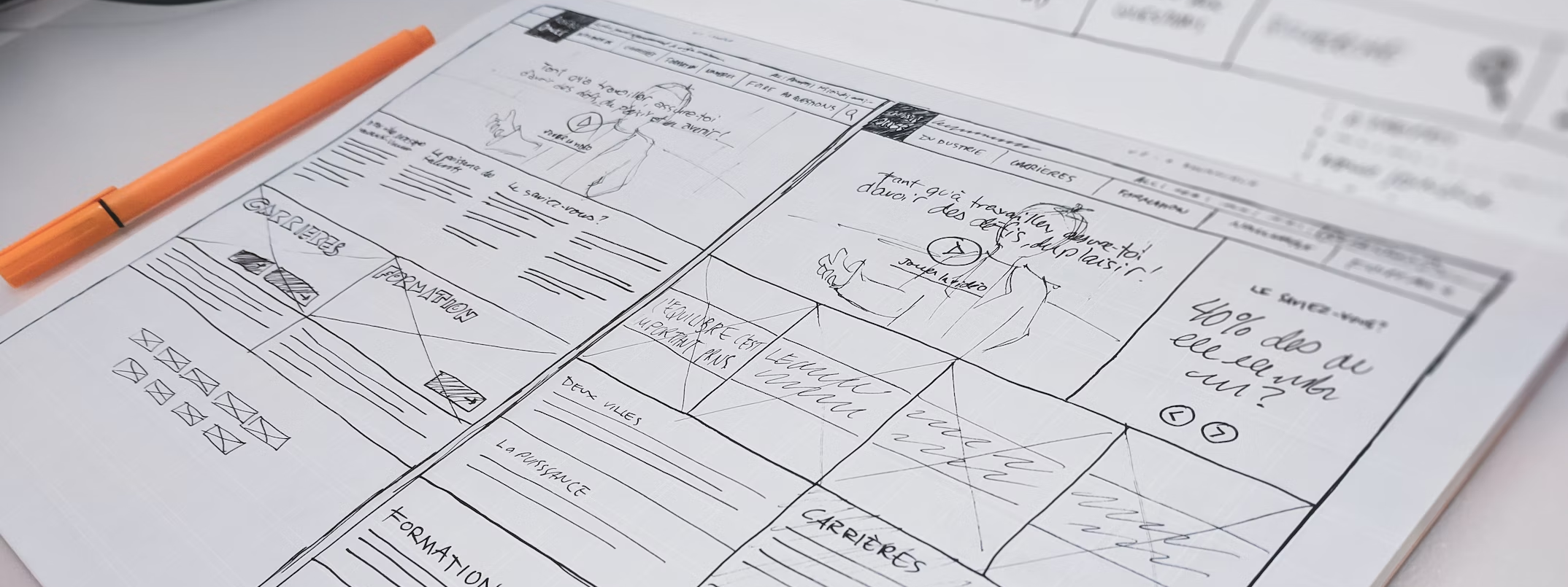
Creating separate wireframes to determine the layout of a web page at various breakpoints
-
Implementing, testing, and deploying a responsive website using CSS media queries and flexbox
The best way to learn these skills is to follow along step-by-step and type out all the code yourself.
Problem Statement & Setup

We'll explore abovementioned topics by attempting to solve this problem statement:
PROBLEM: Make the following improvements to the Jovian Careers Site built in the previous lesson:
Use different layouts different screen sizes to ensure the page shows up properly on any device
Use CSS flexbox to make the layout fluid and ensure it adapts properly to any screen width
Set up a GitHub repository for the code and deploy the site to the cloud using Vercel.